A Matter of Style
Before we continue, I want to take a moment to observe some of the artistic changes that have been taking place over the last few issues. The X-Men are maturing, both as characters and as a comic. The series is beginning to feel less like a monster-of-the-month novelty and more of an ongoing saga. This is reflected throughout the writing, the layouts, and the artwork itself.
The one point that I’ve already mentioned in my previous post is the new interwoven story arcs. The writing is less episodic, as story lines collide and mesh, events from one adventure triggering the next. Things don’t happen in a vacuum anymore. New writers have been brought on board after Roy Thomas ended his run with issue 43, and they’ve added a lot more depth to the X-Men universe. Gary Friedrich took over initially, but the reins were handed to Arnold Drake in issue 47. So far he can take credit for the Magneto & Mesmero story arc, the introductions of Havok and Polaris, and starting that wonderful plot that stretched from Alex’s graduation all the way to the Sentinels dive bombing into the sun. His work has been some of the best X-Men writing the series has delivered, and he matured the series further than I expected it to be at this point. And yet for whatever reason, Roy Thomas took over again at issue 55 and finished that plot. I like this new Roy Thomas a lot more than the old Roy Thomas. Maybe he just needed a push. He’s broken from the formula of new villain-X-Men fight-villain defeated, as the beginning and endings of story arcs are less pronounced. It’s keeping me more excited to read the next issue, because I know that the current story is going to trail into it, and perhaps continue when I was sure it was over.
A few examples of how the writing has evolved include…
Supporting characters are actually sticking around. In the past there have been a lot of character introductions and alliances that have lasted a single issue and then <POOF!> they’re gone. We haven’t seen Banshee since issue 39, and it was only their second encounter. They’ve only had one significant encounter with Spider-Man and it was back in issue 35. We haven’t seen Namor since issue 6. We haven’t seen Mimic since issue 39, although he did stick around more than most. Havok and Polaris, on the other hand, were introduced and haven’t left. They’re sticking around and letting us get to know them better. They’re also written into the story as more than just a catalyst to either start or end a fight. Instead they have more depth of character and more of a connection with the main characters. They have relationships with the X-Men, not just random encounters. They are important to the plot on a dramatic level, and not just a pragmatic one.
Also, one adventure now leads into the next. The stories of the Living Monolith and the Sentinels could have easily been told as two distinct stories with a defined break. Instead there was a deliberate attempt to weave one into the other, where the second begins before the first has even finished. Now there is this feeling that what is happening this month is always connected to what was happening last month. It’s a more modern approach, and I welcome it. The comic is beginning to feel more like a soap opera and less like Scooby-Doo Mysteries.
In addition to the advancement of the storytelling, there are two visual aspects of this series that have recently received an update. The first is the layout, the actual size, shape, and placement of each panel. Until lately these issues have always used rectangles and squares, with straight vertical and horizontal lines and 90 degree angles all over the page. Your eyes flowed across the page in a way that was traditional and regimented.
Suddenly in issue 54 there is a whole new design aesthetic. Rigid boxes and lines give way to diagonals and curves, circles, overlapping windows, cut-outs, and more. They’re being more creative with space, and it makes the pages more interesting.
The panel barriers seem to almost slice through the page. The panels take on more abstract shapes, forming points, wedges, adding a bit of tension through visual cues.
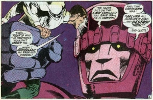
The third major aesthetic change is the introduction of a new artist with issue 56, Neal Adams. He took over for the dependable Werner Roth, and is easily the biggest departure from Jack Kirby since the series first began. Neal Adams is a well known artist, having worked for both Marvel and DC on projects such as Batman and Superman. He is a member of the Will Eisner Hall of Fame. His work feels more organic, and has more inking and shading.
His work ends up more detailed, and I feel it shows a wider range of emotions. His facial expressions show greater pain, anguish, fear, and stress. It helped to give a lot of emotional and dramatic weight to the recent Sentinel story arc, creating a feeling of dread and uncertainty. These past few issues have felt darker and a lot less campy. The shot of the Living Pharaoh directly above is more menacing than any crazy face Magneto ever made. In fact, throughout the past few issues everyone has looked more intense. This helped to elevate the writing.
At times the level of detail reminds me of Bill Sienkiewicz, who is one of my favorite comic artists.
Posted on September 12, 2014, in Ed Posts, Staff. Bookmark the permalink. Leave a comment.


Leave a comment
Comments 0